An alternative way to visualize stocks’ correlations
In the universe of Asset Management, and more precisely in the field of portfolio construction, two of the most used mathematical elements are covariance and correlation matrices. These elements are used to suggest a risk estimation on assets given a specific investment universe. They allow to bring two informations, one relates to the estimation of a standalone risk for each assets (a.k.a the volatility), the second tries to estimate how all the assets behave together (a.k.a the correlation). Here we will focus on the use of correlation matrix.
Before starting to elaborate a portfolio construction process to invest in a specific universe, one should investigate how the universe “looks like”. In other words, we would like to investigate if there are some groups of stocks that tend to behave similarly, that have similar features (a.k.a clusters).
Let’s take an example on major US equities, i.e. on a universe of around 600 stocks.
The basic visualization of a correlation matrix is simply a heatmap of all stocks correlation.
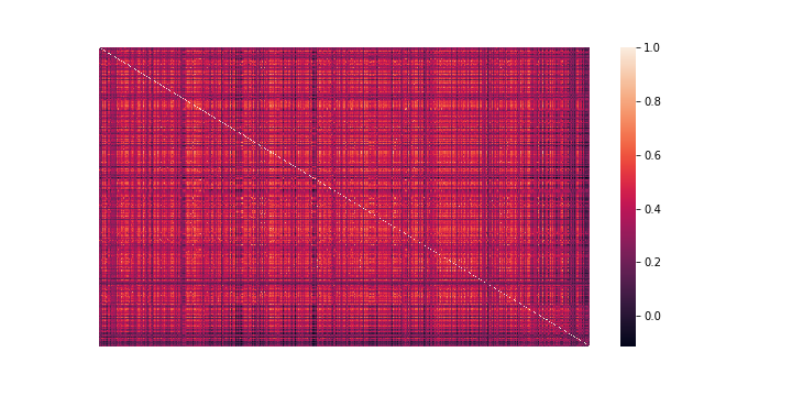
We can’t see much information, as it is not very readable.
Remark: By the way, here correlations are nearly all positive as we are looking in “absolute” terms on stocks, i.e. keeping their beta market component. The purpose of this article is simply to show how to generate a good visualization of stocks’ correlation structure, and not about the matrix generation which alone is a wide subject.
One improvement would be to cluster data thanks to a “linkage” function.
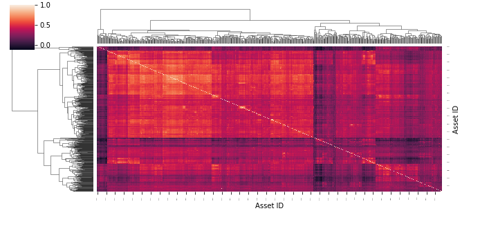
This is a bit better, as we can spot some clusters. But still, with a lot of data, we can’t visually analyze it properly.
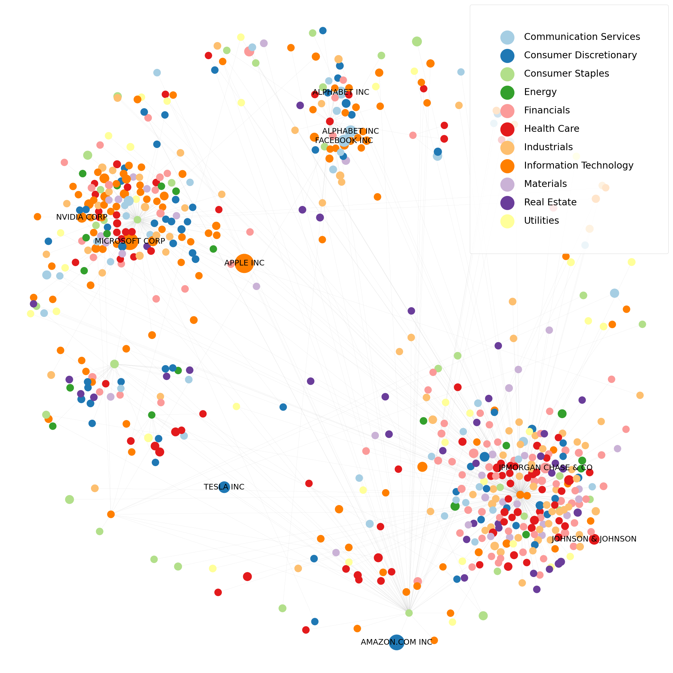
Now, the method we are going to study is part of the Graph Theory field.
Graphs are used to model pairwise relations between objects of a specified universe.
Explained briefly, graphs are mathematical structures that possess two components, nodes and edges. Nodes represent the objects we are studying (here stocks), edges represent the links between all nodes (here correlations, or more precisely distances) and the strength of the links are reflected by a weight feature (here the correlation/distance coefficient).
Like for the clustered heatmap, we apply a linkage function (to compute a distance measure from the correlation matrix) and map data into a graph. Then we apply a minimization algorithm to chart what is called a “minimum spanning tree” (i.e. we minimize the total distance, i.e. the sum of edges’ weights, between all stocks to generate a tree).
Here each node represents a stock, and one “edge” (a link) relates each stock to at least another one which exhibits the most “similarity”. The method is quite simple, starting from the correlation matrix, we compute a distance(1) matrix, which simply reflects the intensity of the correlation between stocks. When much correlated the distance is quite small and vice versa. Nodes are colored by their sectoral affiliation and size of nodes are dependent of the market capitalization of the stock.
Now let’s dig into the code to produce this chart.
We will be using the python library NetworkX which allows to generate and analyze networks, and what is our interest here, a minimum spanning tree.
First, let’s import all the librairies we will use.
import pandas as pd
import numpy as np
import matplotlib.pyplot as plt
import networkx as nx
Then let’s define our data. We load our correlation matrix as well as our stocks data (i.e. name, sector, market cap), inside pandas dataframes.
correl_matrix = pd.read_excel('correlation_data.xlsx')
data_labels = pd.read_excel('label_data.xlsx')
Now that we have our data, we should create a graph object G from our correlation matrix.
G = nx.from_numpy_matrix(np.asmatrix(correl_matrix)) # create a graph G from a numpy matrix
G = nx.relabel_nodes(G,lambda x: correl_matrix.index[x]) # relabel nodes with our correlation labels
From our graph G, we ask to generate the minimum spanning tree(2) (MST) T.
T = nx.minimum_spanning_tree(G)In order to chart our tree, we need to choose a “layout”, i.e. to position graphically our nodes. We will be using Fruchterman-Reingold force-directed algorithm(3) to create the nodes positions.
pos = nx.fruchterman_reingold_layout(T)Now we focus on aggregating our graph data into dataframes, the primary key being “Asset ID”.
nodes = pd.DataFrame(sorted(T.nodes),columns=['Asset ID']).set_index('Asset ID')
nodes = pd.merge(nodes,data_labels,how='left',left_index=True,right_index=True)
edges = pd.DataFrame(sorted(T.edges(data=True)),columns=['Source','Target','Weight'])
As we would like to use sectors to define colors, we transform the “GICS Sector” serie to a pandas Categorical type and store the corresponding sectors codes.
nodes_cat = nodes.copy()
nodes_cat['GICS Sector Cat']=pd.Categorical(nodes_cat['GICS Sector'])
nodes_cat['GICS Sector Cat Code'] = nodes_cat['GICS Sector Cat'].cat.codes
nodes_cat = nodes_cat.reindex(T.nodes()) # keep the right index order
Thanks to the sector codes, we can map a “colormap” to the sectors.
# we create our color pallet
color_df = pd.DataFrame(data=[plt.cm.Paired.colors]).transpose().rename(columns={0:'color'})

# we map the color for each stock accordingly to their sector affiliation
nodes_cat = pd.merge(nodes_cat,color_df, left_on="GICS Sector Cat Code", right_index=True)
nodes_cat = nodes_cat.reindex(T.nodes()) # keep the right index order
For the sake of a better visualization, we will only display the names of stocks that are the biggest in terms of market cap (here a weight in index > 1%). So we create a “labels_to_draw” vector that will store only the label name we want to display and an empty string otherwise.
labels_to_draw = {
     n: (nodes[nodes.index == n]['Asset Name'].values[0]
         if nodes[nodes.index == n]['Active Weight (%)'].values[0]*100 > 1.0
         else '')
     for n in T.nodes
 }
Same for the size of nodes, we create a vector that will store the size for each node, depending on its index weight (i.e. market cap).
node_size_list = {
     n: ((nodes[nodes.index == n]['Active Weight (%)'].values[0]100+1)500)
     for n in T.nodes
 }
As we have all our attributes ready, we can create our plot, with the nx.draw() function. To display a legend, we use empty scatter plots (as there is no such feature in networkx).
plt.figure(figsize=(30, 30))
nx.draw(T, pos, with_labels=True,
        labels=labels_to_draw,
        edge_color = "grey",
        width = .1,
        node_size=list(node_size_list.values()),
        font_size=25,
        node_color = nodes_cat['color'])
for v in range(len(nodes_cat['GICS Sector Cat'].cat.categories)):
    plt.scatter([],[], color=plt.cm.Paired.colors[v], label=nodes_cat['GICS Sector Cat'].cat.categories[v],s=10)
plt.legend(loc=1,markerscale=14., labelspacing=1, borderpad=3, fontsize=30)
plt.show()
To sum up, in this article we were able to produce an alternative way to visualize the correlation structure of an equity market universe. With this methodology, we can visually analyze more precisely on the existence of clusters and link it to some stocks characteristics (market cap, sectors, etc.).
Remarks
- (1) The distance measure usually used for correlations is the Euclidian distance:
d = \sqrt {2 \times(1- \rho)}- (2) The MST algorithm used here is Kruskal’s algorithm. Another widely used algorithm is PRIM’s algorithm.
- (3) An alternative layout, that fits well in our use case, is the Force Atlas algorithm, but unfortunately it is not directly available on the networkx lib.
- To manually produce MSTs in a more advanced way, Gephi software is really useful and well equiped.