Advanced Data Visualization on a Covid19 database
First post of this blog!
It will be about data vizualization, we will explore how we can make dynamic charts (see below).
We will extract the data we need from a Covid19 database, which we can find on a Github repository managed by a John Hopkins University team.
https://github.com/CSSEGISandData/COVID-19/tree/master/csse_covid_19_data
This database basically store, each day, new confirmed cases, new deaths or new recovery cases linked to Covid19 for each country.
The main purpose here is not the data quality (which can be questionnable!), but tips to display it in dynamic ways, to complement static charts for better data visualization.
Step 1 – Download data
First we load our main libraries we will be using:
import pandas as pd
import numpy as np
import matplotlib.pyplot as plt
from matplotlib import animation
from matplotlib.offsetbox import AnchoredText
import cartopy.crs as ccrs
import cartopy.feature as cfeature
from IPython.display import HTML
We can load the files:
# URL links

url_confirmed = "https://raw.githubusercontent.com/CSSEGISandData/COVID-19/master/csse_covid_19_data/csse_covid_19_time_series/time_series_covid19_confirmed_global.csv"
url_recovered = "https://raw.githubusercontent.com/CSSEGISandData/COVID-19/master/csse_covid_19_data/csse_covid_19_time_series/time_series_covid19_recovered_global.csv"
url_death = "https://raw.githubusercontent.com/CSSEGISandData/COVID-19/master/csse_covid_19_data/csse_covid_19_time_series/time_series_covid19_deaths_global.csv"

# Download csv

data_confirmed = pd.read_csv(url_confirmed, error_bad_lines=False)
data_recovered = pd.read_csv(url_recovered, error_bad_lines=False)
data_death = pd.read_csv(url_death, error_bad_lines=False)
Step 2 – Transform data
The 3 dataframes are nearly identical, it looks like that:
(sample)
| Province/State | Country/Region | Lat | Long | 1/22/20 | 1/23/20 | 1/24/20 | 1/25/20 | 1/26/20 | 1/27/20 | 1/28/20 | 1/29/20 | |
|---|---|---|---|---|---|---|---|---|---|---|---|---|
| 0 | Afghanistan | Afghanistan | 33 | 65 | 0 | 0 | 0 | 0 | 0 | 0 | 0 | 0 |
| 1 | Albania | Albania | 41.1533 | 20.1683 | 0 | 0 | 0 | 0 | 0 | 0 | 0 | 0 |
| 2 | Algeria | Algeria | 28.0339 | 1.6596 | 0 | 0 | 0 | 0 | 0 | 0 | 0 | 0 |
| 3 | Andorra | Andorra | 42.5063 | 1.5218 | 0 | 0 | 0 | 0 | 0 | 0 | 0 | 0 |
| 4 | Angola | Angola | -11.2027 | 17.8739 | 0 | 0 | 0 | 0 | 0 | 0 | 0 | 0 |
Now we would like to transform a bit to be more user friendly, below the example for the recovery dataframe: (same logic for the other DFs)
all_countries = data_recovered['Country/Region'].unique() # list all countries
all_index = pd.to_datetime(data_recovered.columns[4:]) # list all dates
data_recovered_hist= pd.DataFrame(columns=all_countries,index=all_index) # create empty DF

# iterate through countries to compute aggregated timeseries
for country in all_countries:
    data_recovered_hist[country]  = data_recovered[data_recovered['Country/Region'] == country][data_recovered[data_recovered['Country/Region'] == country].columns[4:]].astype(float).sum()
Now we have something like this:
(sample)
| Afghanistan | Albania | Algeria | Andorra | Angola | |
|---|---|---|---|---|---|
| 2020-01-22 00:00:00 | 0 | 0 | 0 | 0 | 0 |
| 2020-01-23 00:00:00 | 0 | 0 | 0 | 0 | 0 |
| 2020-01-24 00:00:00 | 0 | 0 | 0 | 0 | 0 |
| 2020-01-25 00:00:00 | 0 | 0 | 0 | 0 | 0 |
| 2020-01-26 00:00:00 | 0 | 0 | 0 | 0 | 0 |
We can compute active cases (Confirmed cases minus people who have died or who have recovered):
data_active_hist = data_confirmed_hist - data_death_hist - data_recovered_histWe retrieve all geolocalization data in a new dataframe
data_coord = pd.DataFrame(index=data_active_hist.columns,columns=['latitude','longitude'])
for cnty in data_coord.index:
    data_coord.loc[cnty] = [data_death[(data_death['Country/Region'] == cnty)].sort_values(data_death.columns[-1],ascending=False)['Lat'].values[0],data_death[(data_death['Country/Region'] == cnty) ].sort_values(data_death.columns[-1],ascending=False)['Long'].values[0]]
(sample)
| latitude | longitude | |
|---|---|---|
| Afghanistan | 33 | 65 |
| Albania | 41.1533 | 20.1683 |
| Algeria | 28.0339 | 1.6596 |
| Andorra | 42.5063 | 1.5218 |
| Angola | -11.2027 | 17.8739 |
Step 3 – Generate charts
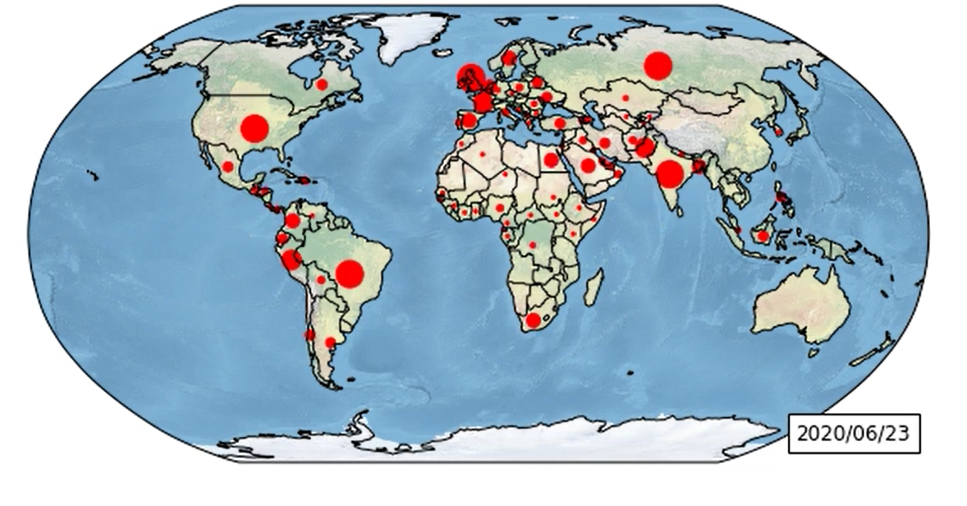
Figure 1 – The world map
We are going to use the python library Cartopy that deals with geographic charts: https://scitools.org.uk/cartopy/docs/latest/index.html
With this library we can have a world map, with coast lines or country borders already plotted. We only have to provide some latitude and longitude data to add custom markers.
Here we want to plot the evolution of “declared” active cases. However to avoid getting a messy map, we will mark only the biggest countries by red dots.
Size of red dots will depend of the number of active cases, like the sample table below:
| Size of node | Lower bound | Upper bound |
| 0 | 0 | 1000 |
| 4 | 1000 | 5000 |
| 8 | 5000 | 10000 |
| … | … | … |
We define an animate() function that is going to mark, for each date, the countries (with a dot) accordingly to the “size” mapping. This function will be called when we create our animation.FuncAnimation().
The code below:
time_window = len(all_index) #Number of frames
fig = plt.figure(figsize=(12,5))
ax = fig.add_subplot(1, 1, 1, projection=ccrs.Robinson())
ax.set_global()
ax.stock_img()
ax.coastlines()
ax.add_feature(cfeature.BORDERS)
text = AnchoredText(format(data_active_hist.iloc[0].name.strftime('%Y/%m/%d')), loc=4, prop={'size': 12}, frameon=True)
ax.add_artist(text)
scat = []
def animate(i):
global scat
for cont in ax.containers:
cont.remove()
merged_data = data_coord.merge(pd.Series(data_active_hist.iloc[i], name="active"), left_index=True, right_index=True)
conditions = [(merged_data['active'] < 1000),
(merged_data['active'] >= 1000) & (merged_data['active'] < 5000),
(merged_data['active'] >= 5000) & (merged_data['active'] < 10000),
(merged_data['active'] >= 10000) & (merged_data['active'] < 20000),
(merged_data['active'] >= 20000) & (merged_data['active'] < 40000),
(merged_data['active'] >= 40000) & (merged_data['active'] < 80000),
(merged_data['active'] >= 80000) & (merged_data['active'] < 160000),
(merged_data['active'] >= 160000)]
choices = [0, 4, 8, 16, 32, 64, 128, 256]
merged_data['marker_size'] = np.select(conditions, choices, default=0)
# scatter plot
if scat:
scat.remove()
scat = ax.scatter(merged_data['longitude'], merged_data['latitude'], marker='o', c='red', s=merged_data['marker_size'], transform=ccrs.Geodetic())
text.txt.set_text(format(data_active_hist.iloc[i].name.strftime('%Y/%m/%d'))) # change date in the legend
return text,
anim=animation.FuncAnimation(fig, animate, repeat=False,
blit=False, frames=time_window, interval=300)
plt.close(fig)
# we can have either save it as a file
anim.save('covid_active_dynamic_map.mp4')
# or display it in a notebook using HTML
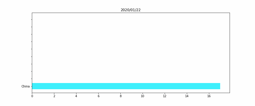
#HTML(anim.to_jshtml())Figure 2 – The horizontal bar plot
We will perform a simple horizontal bar plot, with the 10 worst countries, regarding the total deaths “officially” linked to Covid19.
The idea here is to assign for each country a unique color, for a better vizualization. Otherwise when a country’s ranking would change, its color would also.
As for Figure 1 we are using the animation library, for each frame we look up at the 10 worst countries, then plot them.
Remark: We add a while condition that checks if we don’t have 10 countries (for the beginning of the crisis, when there were no deaths except in China), we fill with empty data, to keep a constant size bar plot.
color_countries = [] # we attribute a unique colour for each country
for cnty in all_countries:
    r = np.random.rand()
    b = np.random.rand()
    g = np.random.rand()
    color_countries.append([r,g,b])
color_countries = pd.Series(color_countries)

time_window = len(all_index) #Number of frames

fig = plt.figure(figsize=(12,5))
ax = fig.add_subplot()

def init_animate():
    ax.clear()

def animate(i):
    for bar in ax.containers:
        bar.remove()
    spot_vector = data_death_hist.iloc[i]
    spot_vector = spot_vector[spot_vector>0].sort_values(ascending=False).head(10)
    spot_vector = spot_vector.sort_values(ascending=True)
    this_colors = color_countries[np.array([pd.Series(all_countries).loc[pd.Series(all_countries)==i].index[0] for i in spot_vector.index])]

    while len(spot_vector) < 10:
        spot_vector = spot_vector.append(pd.Series(index=[""],data=0))
        this_colors = this_colors.append(pd.Series(index=[""],data=[[0,0,0]]))
    yticks = np.arange(len(spot_vector))


    ax.barh(y=yticks, width=spot_vector, color=this_colors, tick_label=spot_vector.index)
    ax.set_title(all_index[i].strftime('%Y/%m/%d'))

anim=animation.FuncAnimation(fig, animate, repeat=False,init_func=init_animate,
                             blit=False, frames=time_window, interval=300)

plt.close(fig)

# we can have either save it as a file
anim.save('covid_death_dynamic_barplot.gif', writer='pillow')

# or display it in a notebook using HTML
#HTML(anim.to_jshtml())That’s it!
These were two examples of how we can make dynamic charts, which can be complementary when paired with static charts, for a good data visualization.